Plotly is a data visualization library that allows users to create interactive and visually appealing plots and dashboards. It supports a wide range of chart types, including scatter plots, line charts, bar charts, pie charts, 3D plots, geographic maps, and more. Plotly is known for its interactive features, allowing users to explore and interact with data directly in the visualizations.
Key features of Plotly include:
Interactivity: Plotly visualizations are interactive by default. Users can hover over data points to see details, zoom in and out, pan across charts, and perform other interactive actions.
Online Platform: Plotly provides an online platform (Plotly Chart Studio) where users can create, edit, and share their charts and dashboards. It also supports collaboration and sharing within teams.
Wide Language Support: Plotly can be used with various programming languages, including Python, R, Julia, and JavaScript. There are Plotly libraries and APIs available for different languages.
Dash Framework: Plotly offers Dash, a framework for building interactive web applications using Plotly visualizations. Dash allows users to create dashboards and applications with interactive Plotly charts.
Support for Jupyter Notebooks: Plotly works well with Jupyter Notebooks, allowing users to create interactive plots within the notebook environment.
# Google colab already includes plotly, otherwise it could be installed first:
!pip install plotly

# importing plotly
import plotly.express as px

# Sample data
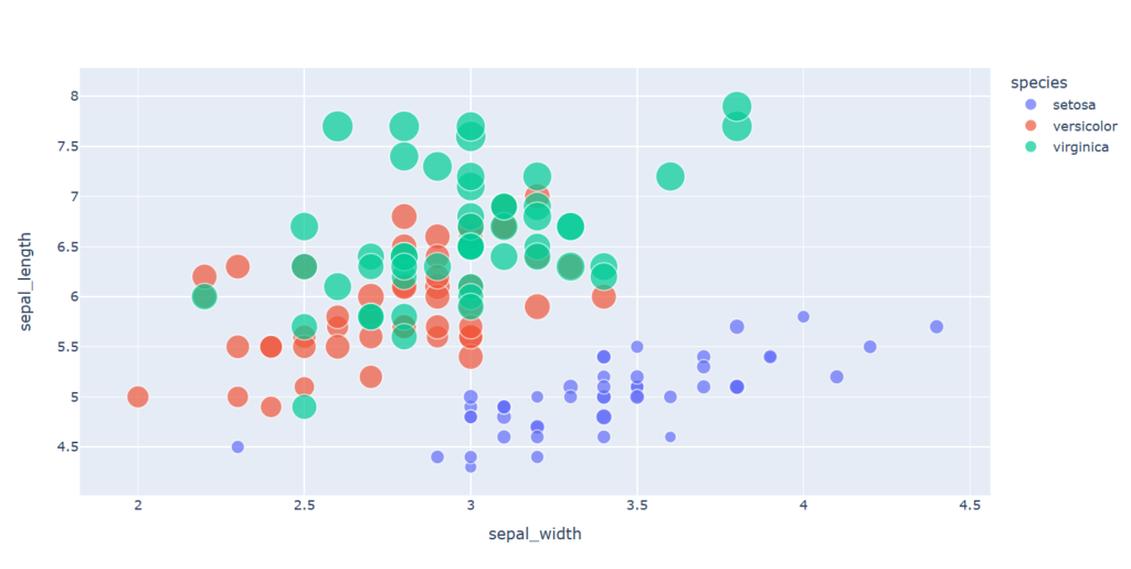
data = px.data.iris()

# Create a scatter plot with Plotly
fig = px.scatter(data, x='sepal_width', y='sepal_length', color='species', size='petal_length')

# Show the plot
fig.show()
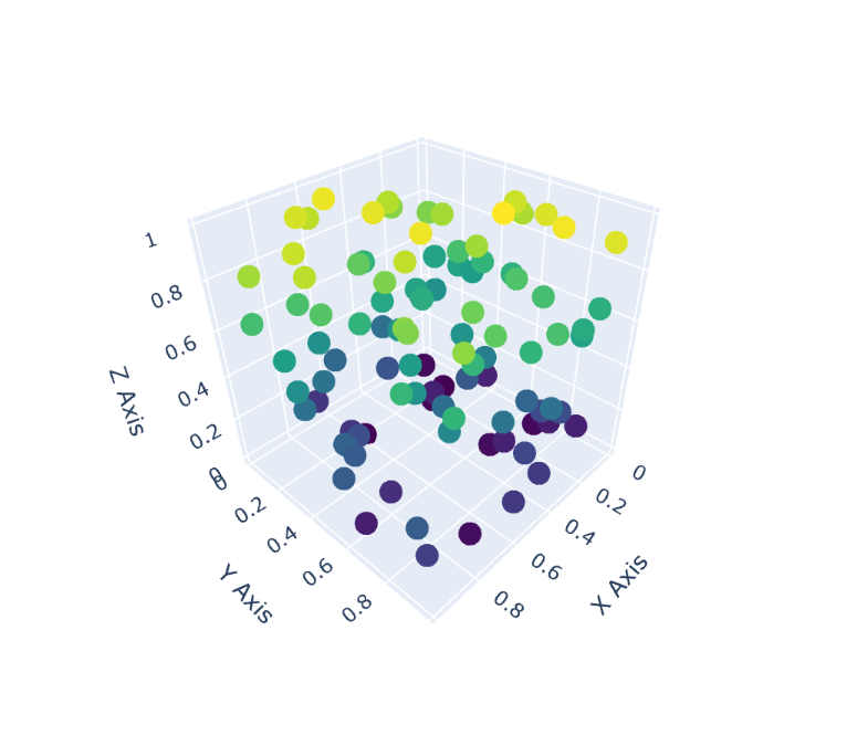
To create a 3D plot with Plotly in Python, you can use the plotly.graph_objects module. Here’s a simple example of creating a 3D scatter plot:
import plotly.graph_objects as go
import numpy as np

# Sample data
np.random.seed(42)
n_points = 100
x = np.random.rand(n_points)
y = np.random.rand(n_points)
z = np.random.rand(n_points)

# Create a 3D scatter plot with Plotly
fig = go.Figure(data=[go.Scatter3d(x=x, y=y, z=z, mode='markers', marker=dict(size=8, color=z, colorscale='Viridis'))])

# Set axis labels
fig.update_layout(scene=dict(xaxis_title='X Axis', yaxis_title='Y Axis', zaxis_title='Z Axis'))

# Show the plot
fig.show()
To Zoom In, you can click inside the graph and drag to make a selection.
When you hover a Boxplot of Plotly, it shows the lower fence, min, q1, median, q3, upper fence, and max.