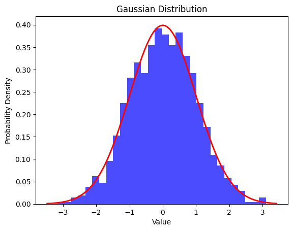
A Gaussian distribution, also known as a normal distribution, is a continuous probability distribution that is symmetric around its mean, forming a bell-shaped curve. It is a fundamental concept in statistics and probability theory. The shape of the distribution is characterized by its mean (average) and standard deviation.
The probability density function (PDF) of a Gaussian distribution is given by the formula:
Key properties of a Gaussian distribution include:
Symmetry: The distribution is symmetric around its mean, with approximately 68.26% of the data falling within one standard deviation (<σ) of the mean (μ), 95.44% within two standard deviations (2σ), and 99.72% within three standard deviations (<3σ). The rest, 0.28% of the whole data, lies outside three standard deviations (>3σ) of the mean (μ), and this part of the data is considered as outliers.
Bell-shaped curve: The probability density is highest at the mean and decreases as values move away from the mean in both directions.
Central Limit Theorem: The sum (or average) of a large number of independent and identically distributed random variables, regardless of their original distribution, tends to follow a Gaussian distribution.
Gaussian distributions are widely used in various fields, including statistics, physics, finance, and machine learning, due to their mathematical properties and applicability to real-world phenomena.
You can draw a Gaussian distribution in Python using libraries such as numpy and matplotlib. Here’s a simple example:
import numpy as np
import matplotlib.pyplot as plt

# Generate data points for a Gaussian distribution
mean = 0  # Mean of the distribution
std_dev = 1  # Standard deviation of the distribution
num_points = 1000  # Number of data points

data = np.random.normal(mean, std_dev, num_points)

# Plot the histogram of the data
plt.hist(data, bins=30, density=True)

# Plot the probability density function (PDF) of the Gaussian distribution
xmin, xmax = plt.xlim()
x = np.linspace(xmin, xmax, 100)
pdf = (1/(std_dev * np.sqrt(2 * np.pi))) * np.exp(-(x - mean)**2 / (2 * std_dev**2))
plt.plot(x, pdf, color='red')

# Add labels and title
plt.xlabel('Value')
plt.ylabel('Probability Density')
plt.title('Gaussian Distribution')

# Show the plot
plt.show()
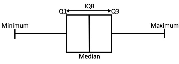
Let’s review the Box Plot of the Gaussian Distribution
In the above figure,
Minimum is the minimum value in the dataset,
Maximum is the maximum value in the dataset.
So the difference between the two tells us about the range of dataset.
The Median is the median (or center point), also called second quartile of the data.
Q1 is the first quartile of the data, i.e., to say 25% of the data lies between minimum and Q1.
Q3 is the third quartile of the data, i.e., to say 75% of the data lies between minimum and Q3.
The difference between Q3 and Q1 is called the Inter-Quartile Range or IQR.
IQR = Q3 - Q1
Any data point less than the Lower Bound or more than the Upper Bound is considered as an outlier.